

WooCharty
WooCharty is a modern smart and deep WooCommerce analytics dashboard plugin that turns store data into actionable insights.
Cost / License
- Pay once
- Proprietary
Platforms
- Wordpress
- WooCommerce

WooCharty
Features
- WooCommerce
 WooCommerce Integration
 WordPress Integration
Tags
- woocommerce-plugin
- WordPress Plugin
- WordPress
WooCharty information
Developed by
 uptixa
 Licensing
Proprietary and Commercial product.Pricing
One time purchase (perpetual license) ranging between $30 and $39.Alternatives
0 alternatives listedSupported Languages
- English
What is WooCharty?
WooCharty is a modern WooCommerce analytics dashboard built for people who need answers fast without exporting spreadsheets, building BI dashboards, or digging through scattered reports. It turns your store’s raw orders, products, customers, and refunds into clean KPIs, clear trends, and automated observations you can act on in minutes.
Most analytics tools either stay too basic (sales totals, a few charts) or become too complex (BI platforms that require setup, tagging, and constant maintenance). WooCharty sits in the sweet spot: it goes deeper than “default analytics,” but stays practical and readable for store owners, marketers, and teams who want daily clarity.
What makes WooCharty different is that it doesn’t just show numbers — it shows meaning. Instead of presenting ten charts and leaving you to guess what changed, WooCharty is designed around decision-making: order quality, discount pressure, refund leakage, retention health, product momentum, and revenue concentration risk. That’s where real profit is made or lost.
KEY CAPABILITIES AT A GLANCE
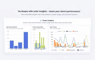
Order Intelligence (Beyond “Orders Count”) WooCharty helps you understand the quality and timing of sales, not just the quantity.
Order Size Distribution: orders grouped into value buckets (e.g., 0–25, 25–50, 50–100, 100–200, 200+), so you can quickly see shifts in basket size and buyer intent.
Coupon Usage Over Time: daily orders with coupon vs without coupon, so you can spot discount reliance early (especially after campaigns).
Orders by Hour and by Weekday: identify peak buying windows in your store timezone — perfect for scheduling promotions, ads, email blasts, and flash sales.
Net vs Gross Trend: a clear view of gross sales, realized net sales, discounts, and refunds across the selected range — so you can see what revenue is truly “kept.”
Practical impact: You’ll know when order quality is improving or slipping, whether sales growth is coming from full-price demand or coupon dependency, and when customers actually buy — not when you post.
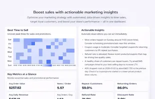
KPI Averages That Make Marketing Decisions Easier Most dashboards show totals. Totals are not enough for optimization. WooCharty focuses on averages and rates that actually guide actions.
Average Order Value (AOV)
Items per Order
Average Daily Net Revenue
Average Orders per Day
Then it layers on the signals marketers care about:
Repeat Customers % and Returning Orders % for retention health
Refund Rate %, Discount Rate %, and Coupon Orders % for quality pressure
WooCharty also includes a “Best Time to Sell” heatmap (weekday × hour) that makes campaign scheduling obvious at a glance.