Chec is an extendable eCommerce platform and developer API with simple tools to help you deliver beautiful eCommerce experiences. Chec makes selling physical products, digital goods, and services easy and intuitive.
 United States
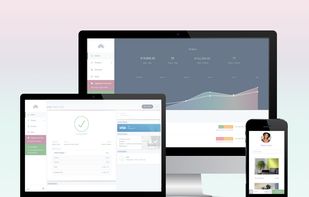

Chec is an extendable eCommerce platform and developer API with simple tools to help you deliver beautiful eCommerce experiences. Chec makes selling physical products, digital goods, and services easy and intuitive.

Responsable is a responsive HTML CSS LESS SCSS framework with clean markup, normalized CSS, and responsive images. It allows for nested columns for easy grid nesting and customization, and provides base styles for forms, tables, and typography for faster startup on your projects.
 Bootstrapand
 Tailwind CSSBootstrapandTailwind CSS
Onstipe is a social media aggregator tool that helps brands collect, curate & create a social wall for displaying social media feeds on websites and digital screens.


 Curator.ioand
 Tagembed
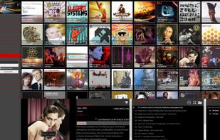
atmosph3re is a web-based music streamer, allowing you to play your music from anywhere, on any device. Built in responsive design, it works as well on your phone as on your desktop.

The Goldilocks Approach to Responsive Web Design - A good starting point for design that takes device resolution out of the equation.
BootstrapandTailwind CSS
Let Simbla's AI design a tailor-made CRM solution for you. Just explain your CRM business requirements, and it will construct a fully personalized CRM, complete with a no-code platform, landing pages, and a dedicated customer portal.


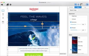
Mail Designer 365 is your HTML mail creator software and the easiest way to create and optimize HTML email newsletter designs that look great on desktop computers and mobile devices.
 BootstrapandTailwind CSS
Whether you want it or not, your site is going mobile - every day. Use Ghostlab to make sure all your users get the same neat experience - whatever operating system, browser or smart phone they are using.
 Browsersyncand
 DOMScope
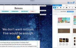
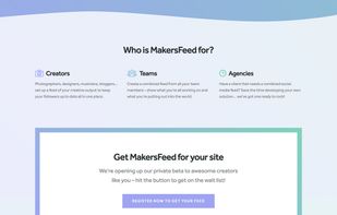
MakersFeed helps you create a beautiful aggregated feed from all your social networks, and embed it on your own website. It fetches new posts automatically, you can customize the design to match your site, and there's no coding required.


 ContentStudio
Google's front-end web framework for building sites to the Material Design specification.

 BootstrapandTailwind CSSBootstrapandTailwind CSS
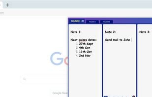
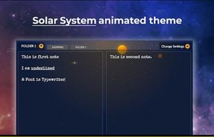
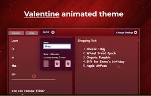
Take notes lightning-fast right inside your browser! It is a unique take on Safe & quick jotting down experience. Must try for everyone who work on laptops / desktop.
 Zimand
 CherryTree
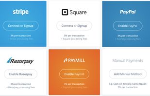
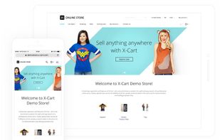
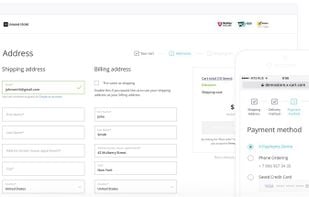
X-Cart is a well-established licensed software that supports tons of eCommerce features either out of the box or as a ready-made extension. With 100% open code, it's customisable, easy to install, upgrade and use.
 PrestaShopand
 WooCommerce
M1 Finance is a first-of-its-kind automated investment platform that lets people create, organize, and automate an investment portfolio. A user selects their investments and specifies the percentage of money that goes into each.


 Robinhood
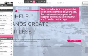
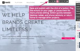
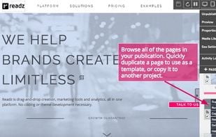
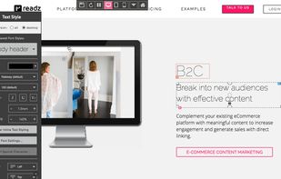
Readz is a powerful and flexible browser-based CMS for building and managing responsive websites. Forget plugins and extensions. Readz comes fully equipped with all of the design, marketing, high-speed architecture, and integration tools needed to create fully optimized pages in...

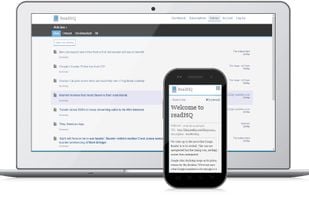
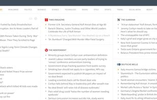
All your favorite feeds in one place.
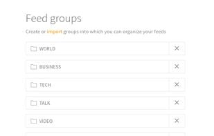
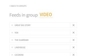
ReadHQ is a new RSS reader which allows you to import, add, manage, organize and enjoy your feeds. ReadHQ has:

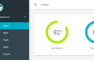
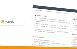
Simple beautiful web-based dashboard for all your RSS newsfeeds. It's simple and handy, neat, focused on oversight ability and empowers you to effectively pick up the articles you are truly interested in, even from an incredible number of sources.

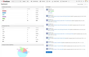
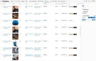
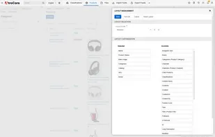
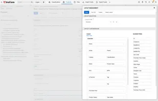
AtroPIM is an open-source Product Information Management solution for businesses of any size. It centralizes product data management and stands out for its affordability, modularity, flexible deployment, and mobile-friendly design.
 Sales Layerand
 Pimcore
Set column and gutter widths, choose the number of columns, and switch between pixels and percentages.
BootstrapandTailwind CSS
A collaborative online web development platform using HTML, CSS and JavaScript with a focus on design systems and financial applications.
 Pastebin.comand
 Replit
inuit.css is a lightweight, constantly updated CSS framework which provides you with a pragmatic and feature-rich starting point for all your projects.
BootstrapandTailwind CSS
960 grid system with 12 columns for Responsive Web Design. PSD file which has the 960 grid setup for you based on 32px gutters/margins.
BootstrapandTailwind CSS


 Germany
 EU
EU

 Spain
Spain
 Switzerland


 United Kingdom


 France